A narrow rowing boat slips through pale morning mist, and a copper-colored stripe catches the first light along its bow. No lettering appears yet. That is how I imagine introducing a fictional community rowing team called the Copper Herons. The name suggests patience, water, and a little brightness, but a plain title card cannot carry all of that by itself. My proposed short film would let the setting and movement establish those qualities before the team name arrives.
I would keep the project modest: a brief opening for a club presentation, followed by a still frame bearing the name in readable type. There is no need to invent a race victory or imply that a real club has commissioned the piece. The example is a creative exercise in connecting a chosen name with an appropriate visual identity. A heron standing at the water’s edge and a boat moving quietly nearby give the idea a simple, coherent world.
A name can suggest a scene without becoming a literal mascot
My first decision would be to avoid a giant metallic bird or a fantasy transformation. Those images might be memorable, but they would push the fictional team toward a different personality. I want the copper accent to appear in the boat and the morning light, while the heron remains an ordinary bird. The connection can be discovered rather than announced. That leaves room for the name to feel like it belongs to the place.
A video experiment in seedance 3.0 gives this naming idea somewhere to move. I would supply an original or properly licensed riverbank image as the setting reference and describe a restrained passage of the boat across the frame. The product’s text and visual-reference video workflows fit that combination: the image establishes the scene, while written direction explains what changes during the shot. The actual team lettering would be added later in an editor.
The riverbank reference should show open water, a clear near edge, and a background that does not compete with the boat. I would choose soft reeds and a low line of trees rather than a busy marina. If a second image establishes the boat’s appearance, it should share the intended perspective and lighting. References that disagree about the hull shape or time of day create unnecessary uncertainty before the motion has even been described.
Give the boat a short, readable journey
For the first seedance 3.0 shot, the camera would remain fixed near the water, with the boat moving slowly from left to right. The copper stripe would be small enough to feel like part of the design, not a glowing effect. A gentle wake could provide the main movement in the foreground. I would keep the rowers distant or outside the tight crop, since the film is about the team’s mood rather than a technical demonstration of rowing form.
My shot brief would describe a quiet river at dawn, a narrow boat passing through the middle distance, soft reflections, and a thin copper accent catching natural light. The boat should keep the same shape throughout. I would not add a camera orbit, a sudden acceleration, and a flock of birds to the same instruction. A single movement leaves the viewer enough attention to notice the color and the calm rhythm that inspired the name.
A plausible first problem is that the stripe appears to crawl across the hull as the boat moves. In seedance 3.0, my revision would reduce the distance traveled and choose a reference with a clearer view of that side. I might also make the stripe wider and simpler in the concept artwork before trying again. The correction should address the unstable detail directly. Asking for a more impressive or more cinematic result would not explain what needs to stay consistent.
The heron belongs in a separate moment
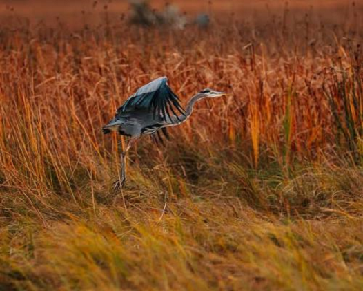
The next shot would show a heron at the river’s edge, viewed from a respectful distance. I would keep the action small: a slight turn of the head, a ripple passing its legs, or a breeze moving the reeds behind it. A separate bird reference gives this shot a clear starting point. There is no need for the bird to fly toward the camera or land on the boat. Those actions would make the metaphor obvious at the expense of the quiet identity I am trying to build.
I would connect the two shots through color and direction. If the boat travels toward the right, the heron can look in the same direction, giving the edit a subtle continuity. The water should have similar brightness in both views. A seedance 3.0 preview that turns the second shot into a golden sunset would need a lighting revision, even if it looks attractive on its own. The pair should feel like two observations from the same morning.
Sound can provide another connection. I imagine a low, soft water ambience and a short wooden tap, perhaps suggesting an oar resting against the boat. Any reference recording should be owned or cleared for this purpose. I would keep music understated until the name appears. The reveal does not need a sports-stadium fanfare; a small lift in the soundtrack can mark the transition while preserving the patient character of the images.
Make the final name easy to read
The last image would return to open water after the boat has passed. That gives the title room to appear without covering the subject. I would add “Copper Herons” in the editing stage, using a simple typeface with enough weight to survive a small screen. The generated video does not need to render the letters. Separating typography from the seedance 3.0 footage makes spelling, placement, and contrast straightforward to control.
I would test a light title against the darker water and a darker title against a pale patch of mist, then choose the version that reads immediately. The words should stay on screen long enough to be remembered. An elaborate animation might look clever but weaken the name’s clarity. If a tagline is needed, it can arrive after the main name rather than compete with it from the first frame. The hierarchy should match the purpose of an introduction.
The finished concept would contain the boat, the heron, and the quiet name reveal, with a short version for a club page and a wider version for a presentation. My final seedance 3.0 pass would target only a visible continuity problem, such as changing hull details or mismatched light. Once the images support the chosen identity, I would stop adding effects. The useful result is a name that feels connected to a place and a rhythm, not simply a name placed over moving scenery.